
The Nintendo Wii is an easy console to pick on for having some unfavorable covers. This is mainly due to the high number of publishers that made quick cash-in titles that many label “shovelware” and honestly even looking in a retailer’s Wii section can produce feelings of anger and sadness at the same time.
I could have a list of about 100 titles just with the topic of “bad box art”, but after excluding quite a few, I have narrowed it down to the five worse Wii Boxarts and whether it be typos, or simply just pure laziness on the publisher’s part, these all fit well into the worst boxart category. Get ready, because here is the top 5 worst arts for the Nintendo Wii.
Imagine Party Babyz
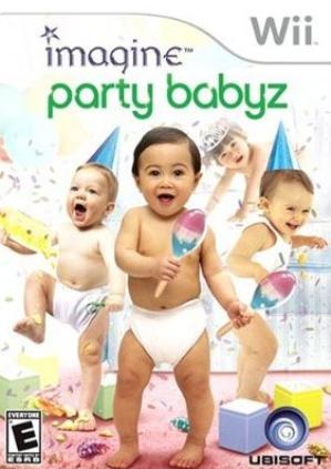
I promised myself I wouldn’t pick on the Imagine series, but this title just represents everything that has turned many gamers away from the Wii to start with. Babies (yes Ubisoft, with no Z!) all put in one image together, playing with photo-shopped toys and maracas. I have seen this title many times out in the wild before and a “sigh” is usually the next thing that follows.
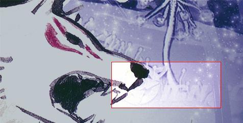
Okami
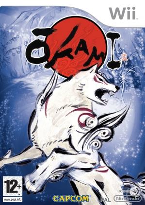
There is nothing at all wrong with the actual art of Okami’s Wii boxart, but what is wrong is the source this image was gotten from.
You would think that the creators of a game would have access to their own image library as well as a team full of editors to catch a big IGN logo faded into this art, but instead this port was known more for it’s box error rather than the actual game itself. I am sure this is one title that will make Capcom always look twice in the future before shipping anything to stores.
Mario Kart Wii
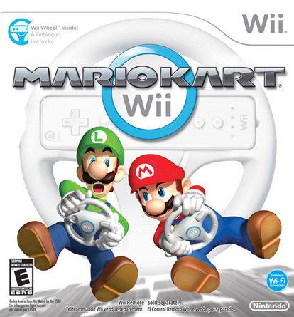
Nintendo have always been known for creating some awesome covers for their first party franchises. I am sure many of you have some prime examples right now that sit proudly on your shelves. For some odd reason though, Nintendo decided to go for “plain” with Mario Kart Wii, which just featured Mario & Luigi on the cover driving invisible vehicles with a blank white backdrop. This would just be a boring cover if it wasn’t for one thing though. Look down. See the shadow of the karts? If they went through all the work of doing that shading, you would think that they would have added a track, some mushrooms, or simply color to make it more appealing. Mario Kart Wii still sold a ton and was quite successful, plain, boring art aside, but that shadow is forever a tease of what could have been if a little more of the classic Nintendo imagination was added to this otherwise dull cover.
Purr Pals
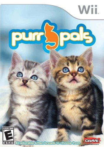
Awww…it’s Purr Pals. They just look adorable and don’t you just want to pick them up and give them a hug? With over 40 B….Wait….Breads!!! What kind of sick game is this!
Spelling errors happen. This is commonly known. When the error is on the front of a game that turns playing with kittens into making sandwiches out of them, then we might have a problem. I’ll take mine with Rye by the way…
My Ballet Studio
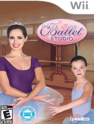
Young Jenny wanted to be a ballet dancer despite only having 4 fingers on her fake, disfigured arm. After a quick head transplant, she did just that and graced the cover of My Ballet Studio.
Dreams do come true!
Next week we will be taking you back to the Sega Genesis/Megadrive. Until then, leave a comment letting us know your opinion for the worst cover on the Wii.