
Since video games first started popping out on shelves, the boxart designs for many great (and horrible) titles have been hit or miss. We have seen fantastic titles such as ICO get generic covers as well as horrible art for bad games that simply act as a warning label for the unfortunate few that actually bite on purchasing them. I think it is now time that the poor choices in design paid their dues.
Each week, we will be going through systems and picking 5 of the worst covers to grace a shelf. Get ready and brace yourselves, as this week we will be looking at the Nintendo DS.
My Horse and Me: Riding For Gold
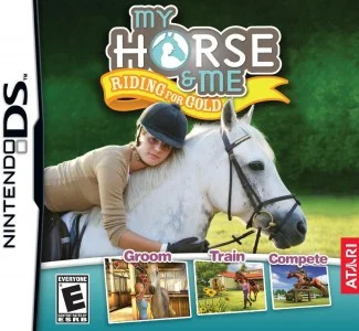
Yeah, I know it seems a bit cruel to go after a series like My Horse and Me, as the series is honestly targeted towards young girls, but in this case, I think most of you will see my point on this one. As you see, what you see with the title is what you get. A girl who certainly loves her horses, but with a blank, soul-less look upon her face as if she is about to send her steed to the nearest glue factory. For some reason, this girl and her horse have been in my Amazon recommendations for about six months now, staring me down every time I open the page and I have been sleeping with my doors locked ever since.
8Ball Allstars
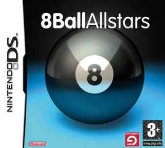
Imagination with any design, even if it is on a subject such as pool can go a long way. Unfortunately using “edgy” and “cutting edge” light effects on an 8 Ball is all the love this art received. The sad thing is that with a name like 8-Ball Allstars, you would think we might see some of those…you know..”all stars” at least playing the sport to make it seem like a jolly ol’ time but instead we just have a ball. Quite literally in this case.
Bubble Bobble Revolution
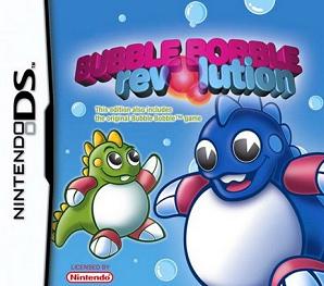
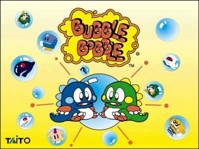
Since the mid-80’s, the Bubble Bobble franchise has been known for providing some top-tier platforming with it’s simple controls and challenging levels. 2006 was a dark year for the series though as not only was the game broken in it’s North American release (leaving players to only access the first 30 levels), but the years just were not good to the beloved Bub & Bob as each appeared bloated and awkward on the cover of Bubble Bobble Revolution, not to mention it being just flat out boring to look at. To put this in perspective of what Bub & Bob usually look like, check out the standards we have always seen for the character designs:
Luckily just two years later both returned to glory with Bubble Bobble Double Shot.
Russel Grant’s Astrology
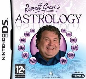
If you live in Europe and visited a game store within the past few years, there is a good chance you might have seen this “interesting” cover for Russel Grant’s Astrology. You know that uncle that comes to family reunions that sits by the refreshment tables, drinks the punch and shouts “WOO ITS A HOT ONE!” while holding a paper fan? This is him, but now on the cover of his very own video game. Being American, I haven’t a clue who Russel Grant really is aside from the obvious occupation in Astrology. I can easily say a worldwide release was not in the “stars” for Mr. Grant though as the North American version scrapped his name and his giddy face from the cover.
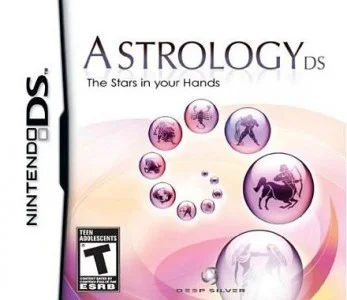
Much better…I guess.
Touch DIC
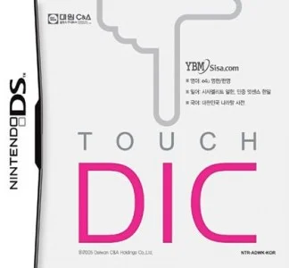
Sometimes language barriers just don’t translate well at all. In the Korean exclusive dictionary software for the Nintendo DS, no one could have been prepared for Touch DIC. With the busy finger on the cover doing all the touching combined with the name itself, this title became a meme in itself for DS owners everywhere back when it was released in 2005. The most humorous part about this whole release is the alternate cover which gave the title it’s proper name, Touch Dictionary.
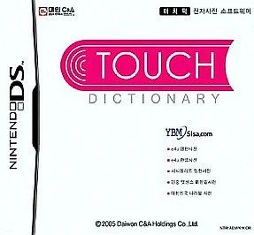
Ah yes, that totally fixed any innuendo.
Join us here next week when we tackle the Nintendo Wii and the many stunning masterpieces that have graced covers for the platform. Until then, leave a comment below and let us know if we missed any, or simply which one of these is your choice for the Worst Box Art on the console..